GeneSearch allows users to look for proteins/contigs across the different planarian transcriptomes and Human reference interactome.
Search form

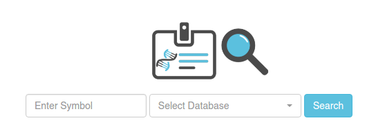
In order to search contigs/proteins, you have to select one of the available datasets (planarian or Human). Then, write one of the following types of symbols:
- Contig identifiers (which will be specific to each transcriptome). E.g. cth1_Trc_comp11081_c0_seq1 (for dataset Cthulhu)
- Human protein symbols. This will retrieve all the homologous contigs to the specified human protein. E.g. THOC2. You can use the wildcard *. E.g. THOC* will display the nodes homologous to THOC, THOC1, THOC2, THOC3, THOC4, THOCXX, etc.
- Gene Ontology identifiers. This will display all the planarian contigs with a human homolog with the specified GO code. E.g. GO:0000002.
- PFAM identifiers. This will retrieve all the planarian contigs with the specified PFAM annotated through our protocol (that is, with HMMER with a e-value cutoff of 10-10). E.g. PF01369.15.
You can do multiple searches at once, using commas ',' to separate each item. You can mix the different types of symbols in the same search, e.g. PF01369.15,GO:0000002.
Results

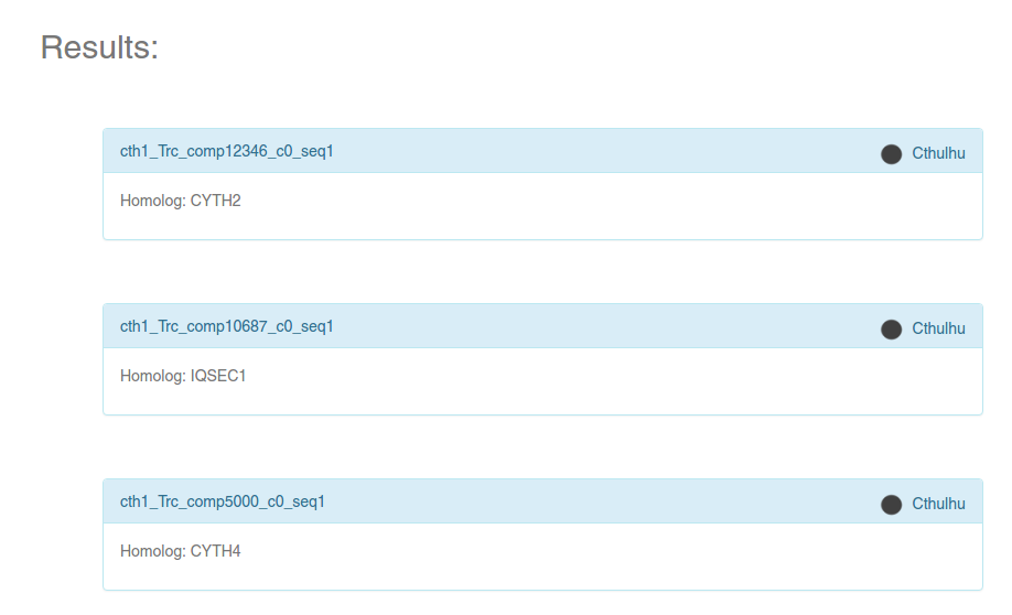
If there are proteins/contigs in the selected dataset that satisfy the search criteria, you will get a list of symbols inside blue boxes (see image). The symbol on the top right of each box always represents the database to which the symbol belongs. If the selected dataset was a Planarian transcriptome, the Human homolog will be specified inside the box, as can be seen in the image.
Click on any of the boxes to get an information card, which will contain a summary of the information stored for that particular protein or contig.
Information card

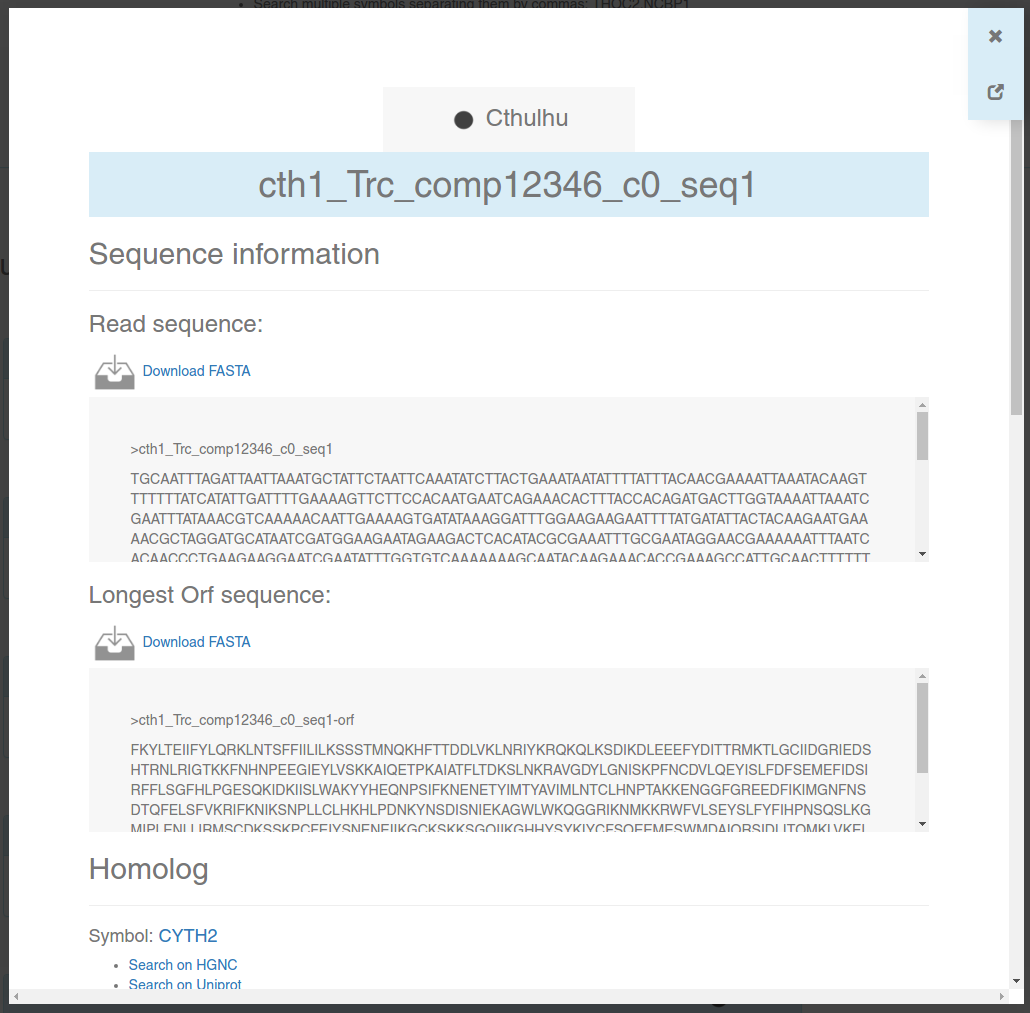
An information card is a brief summary of a contig or protein stored in any of our interactomes. Here, you will be able to download FASTA sequences, look for the annotated homolog for each contig, look for annotated PFAM domains, GO codes, and predicted interactions.
You can navigate through different contigs/proteins without losing the results from GeneSearch, NetExplorer or PathwayFinder: only the information card will change. You can also navigate back using your browser's back button ←.
Close the card using your Esc key or the x button on the top right. If you want to see the card in full-screen mode in a new tab (for example, to print it), click on .
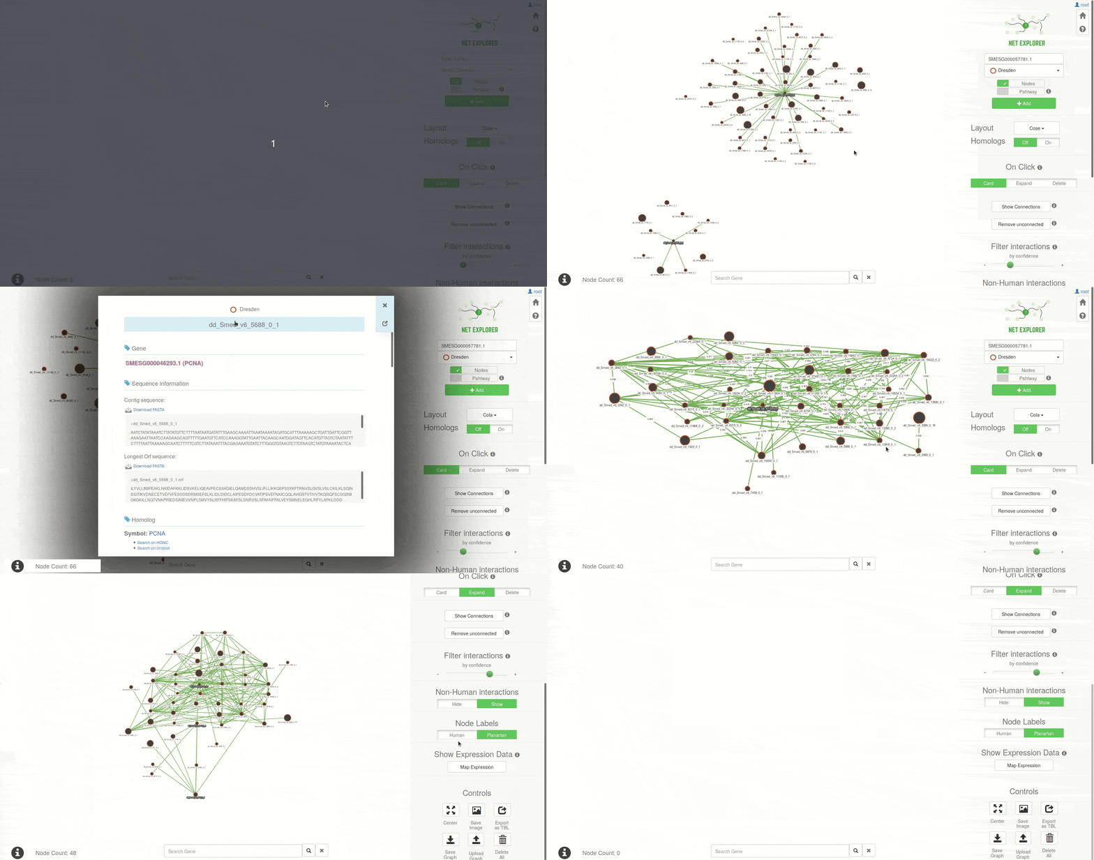
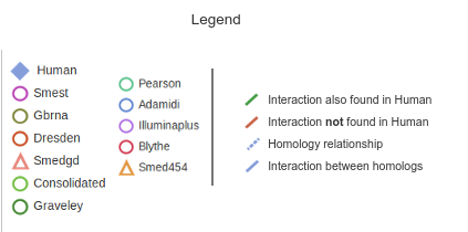
NetExplorer allows users to explore the predicted networks dinamically, adding and removing nodes from several interactomes. Use the menus on the right to manipulate the graph, which will display on the left side of the screen. Each node on the graph will represent a contig (for planarian datasets) or a protein (for the Human reference dataset). These nodes will be connected by edges (lines), and each type of them will have a different meaning:
Search functionality

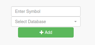
In order to search for contigs, you have to select a Dataset (a planarian transcriptome for which we predicted an interactome), and then look for contigs. You can use 4 types of symbols to do that:
- Contig identifiers (which will be specific to each transcriptome). E.g. cth1_Trc_comp11081_c0_seq1 (for dataset Cthulhu)
- Human protein symbols. This will retrieve all the homologous contigs to the specified human protein. E.g. THOC2. You can use the wildcard *. E.g. THOC* will display the nodes homologous to THOC, THOC1, THOC2, THOC3, THOC4, THOCXX, etc.
- Gene Ontology identifiers. This will display all the planarian contigs with a human homolog with the specified GO code. E.g. GO:0000002.
- PFAM identifiers. This will retrieve all the planarian contigs with the specified PFAM annotated through our protocol (that is, with HMMER with a e-value cutoff of 10-10). E.g. PF01369.15.
You can do multiple searches at once, using commas ',' to separate each item. You can mix the different types of symbols in the same search, e.g. PF01369.15,GO:0000002.
Once you have typed the symbols you want to look for, and have selected the appropiate dataset, click on the button + Add. Note that you will not lose the network already displayed on the left, so you can add nodes individually without losing the visualization.
All the nodes for which you have searched (either using this search function or by "expanding" them, see below) will be outlined in green, so that you can remember them.
Basic controls

1. Layout
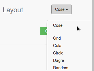
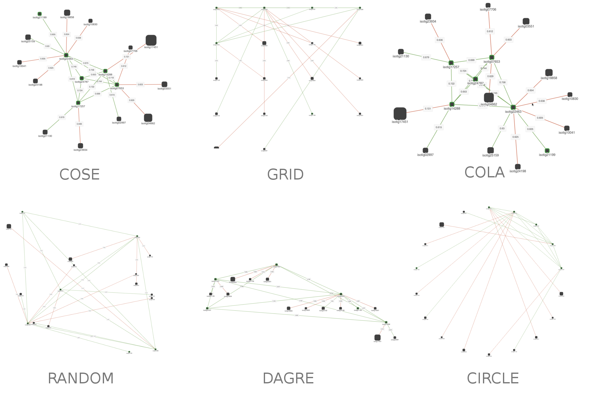
Using this dropdown menu you can select the layout of the network. When you select it, the layout will be run on the display, and the positions of the nodes will change. Take note that some layouts will change each time you run them. There are 6 available layouts right now:
2. Show homologs

When changing this switch to On, the homologs of the displayed planarian contigs will be drawn on the visualization. They will appear as blue diamonds. They behave as all the other nodes, but with the exception that you can't Expand them. Turning this option On or Off will not change the layout of the planarian nodes.
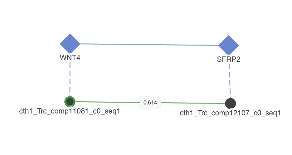
3. Connections manipulation

Show connections:
This button will add all the interactions between the nodes displayed on the visualization. It will NOT add any node.
Remove Unconnected:
Activating this button will remove all the nodes without a visible connection. Note that this applies to all types of connection (homology or interactions). Use together with Filter interactions to filter networks.
4. Filter interactions

With this slider you can hide the interactions using the percentage of votes of the random forest classifier as a cut-off. Note that the hidden interactions are not removed, so you can get them back by using another cut-off.
Right now, the only available cut-offs are: 0.6, 0.65, 0.70, 0.75, 0.8, 0.85, 0.9 and 0.95. You can use this function in conjuction with the Remove Unconnected button to filter the graphs; first filtering the interactions by the desired cut-off, and then removing all the unconnected nodes. This is useful when wanting to work with a more accurate network, or when the nodes displayed on the visualization is too high.
Click behaviour

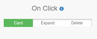
If you have nodes on the visualization, you can determine what the application will do when you click on them. There are 3 possible behaviours, and you can change them by clicking on the appropiate one:
1. Card
When this behaviour is set, an information card for the clicked contig/protein will appear on the screen. These cards are the same displayed in the Gene Search application.
2. Expand
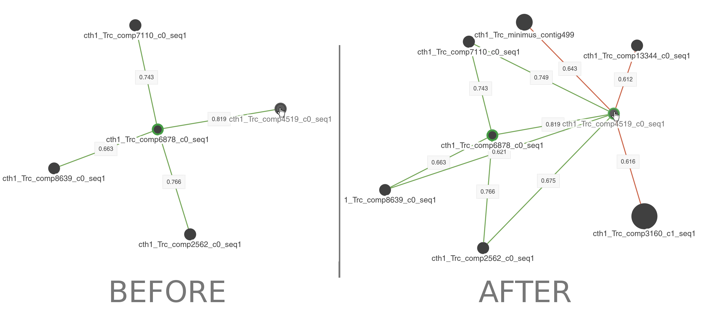
When clicking on nodes you will add all the interactions for such node to the visualization.
3. Delete
Delete the clicked node and all its interactions. Note that all the other nodes displayed on the graph will NOT be removed, even if they have no other interactions.
Expression Data

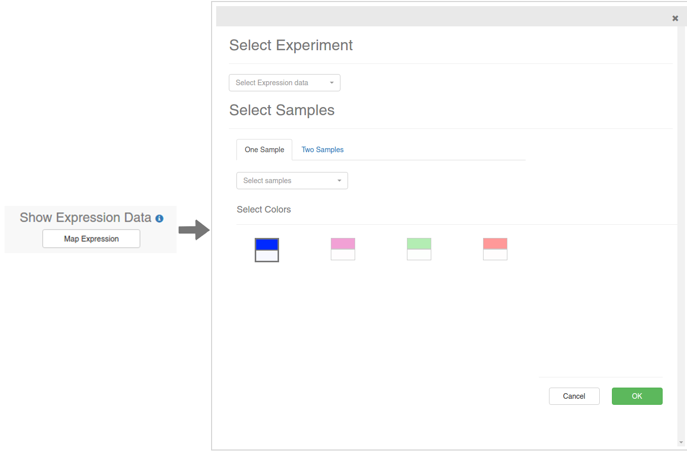
If you click on the Map Expression button, the dialog showed on the above image will appear. Using this dialgo, you will be able to select a Expression experiment and map the expression values over the displayed nodes on the visualization. There are two ways in which you can do this: mapping the values of one sample as a color gradient, or mapping the logFC of two samples as a divergent color gradient. Make sure you are selecting two different samples in the Two Samples mode.
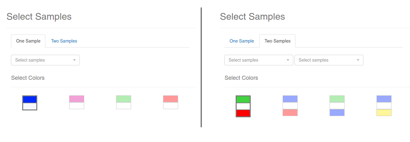
Finally, select a color gradient from the available presets and click OK. The process of fetching the expression values and coloring the nodes may take a while depending on the number of nodes displayed. None of this will change the layout of the nodes, so feel free to experiment with the colors and the samples. When the process is done, a legend will appear on the visualization:

If you are in One Sample mode, each color will represent the percentil to which the expression value belongs; for example, the color for the percentil 10% indicates that the nodes colored like that have a expression value lower than 95% to 90% of the genes in the gene expression experiment.
If you are in Two Samples mode, each color will represent the log2FoldChange between the selected sample 1 and sample 2.
In either case, the nodes colored as NA are contigs for which there is no expression information for that particular experiment and sample.
When a expression experiment has been mapped onto the visualization you can keep adding nodes normally. However, if you want the expression to be mapped to the new added nodes, you have to open the dialog again and re-run the process. Don't expect new nodes to be colored according to the expression information previously mapped.
General Controls

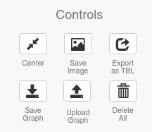
These simple buttons allow users to save, import and export the visualization in several formats, as well as centering it to the screen.

PathwayFinder lets you select two (or more) nodes and retrieve all the possible paths of a given length between them in a particular interactome. Right now, due to performance issues on the client side, the user can only select up to 5 edges separating the given nodes.
Search Form


With this form you can select the ![]() StartingNode and the
StartingNode and the ![]() FinalNode.
FinalNode.
As in other searches in PlanNET, you can use:
- Contig identifiers.
- Human protein symbols (including * wildcards)-.
- PFAM accession codes.
- GeneOntology codes.
Once everything is selected, press the button FIND. The results will appear on the left.
Results

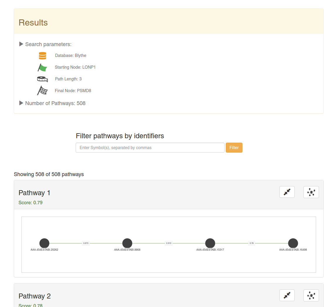
On the top of the screen will appear a summary of the search and the number of results (in this case, 508 pathways).
All the pathways will be sorted by the mean of the votes of all the interactions in it. That is, by the confidence.
You can filter the pathways with specific contigs using the above search box and by clicking on Filter. You can use multiple contig identifiers by using commas ','. You can only use planarian contig identifiers here.
There are two buttons on top of each pathway:
You can click on the nodes to display an information card.
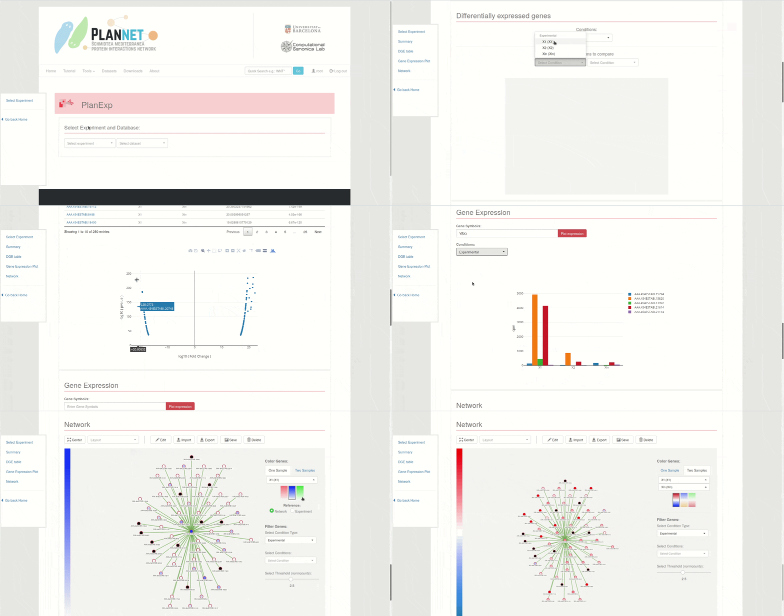
Experiment Selection

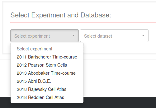
Use the first dropdown menu to select the RNA-seq experiment you want to explore. Each experiment will be mapped over different datasets (transcriptomes or genome references): use the second dropdown to select from the available ones for the selected experiment.

Once an experiment has been selected, a summary will appear on the application. The conditions on the right side correspond to the different factors of the experiment, which could be experimental factors (such as "Section" and "Time", as in the image), or technical ones (such as "Batch" or others). Click on the conditions names to see the "levels" of that "factor".

While selecting the Experiment and the Dataset, different sections will appear in the table of contents section on the right. Click on the desired section title to scroll automatically to the corresping section in the application.
Plot Controls


All plots created by PlanExp are made with Plotly.js, and they all share the controls shown on the image. Click on each button to performed the corresponding action.
 Saves plot as a PNG image.
 Edit data in chart studio (external website).
 Zoom function (select area of graph to zoom-in).
 Pan function (move through the graph area).
 Box select.
 Lasso select.
 Zoom-in button.
 Zoom-out button.
 Autoscale.
 Default zoom level.
 Toggle Spike lines.
 Show closest data on hover.
 Compare data on hover.
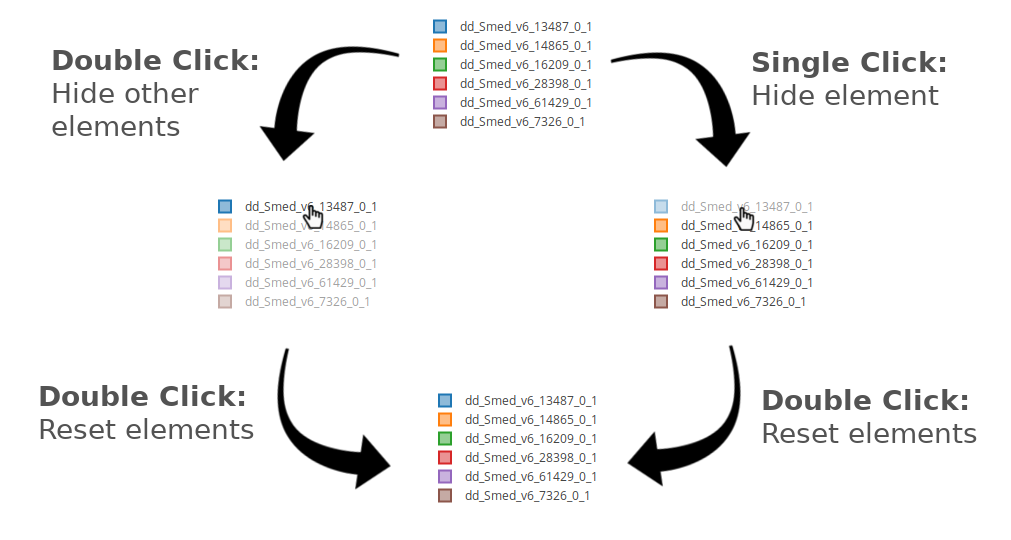
When a trace legend appears on the right, either containing gene/transcript symbols or conditions, use the controls shown on the image below to controls which plot traces to show or hide.
Differential Gene Expression

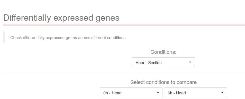
The following section describes how to explore the differentially expressed genes across different conditions. On the first dropdown "Condition" select the desired condition for which you want to compare levels. For example, in a time-course experiment consisting of one condition called "Time", select "Time" on the first dropdown. Doing so will populate the two following dropdown menus with the appropiate levels.
In the case of the experiment "2013 Aboobaker Time-course", there are no comparisons between individual "Hour" levels, only the interaction between the conditions "Hour" and "Section" was computed. As such, select "Hour - Section" on the dropdown menu, and then select the levels you want to compare.
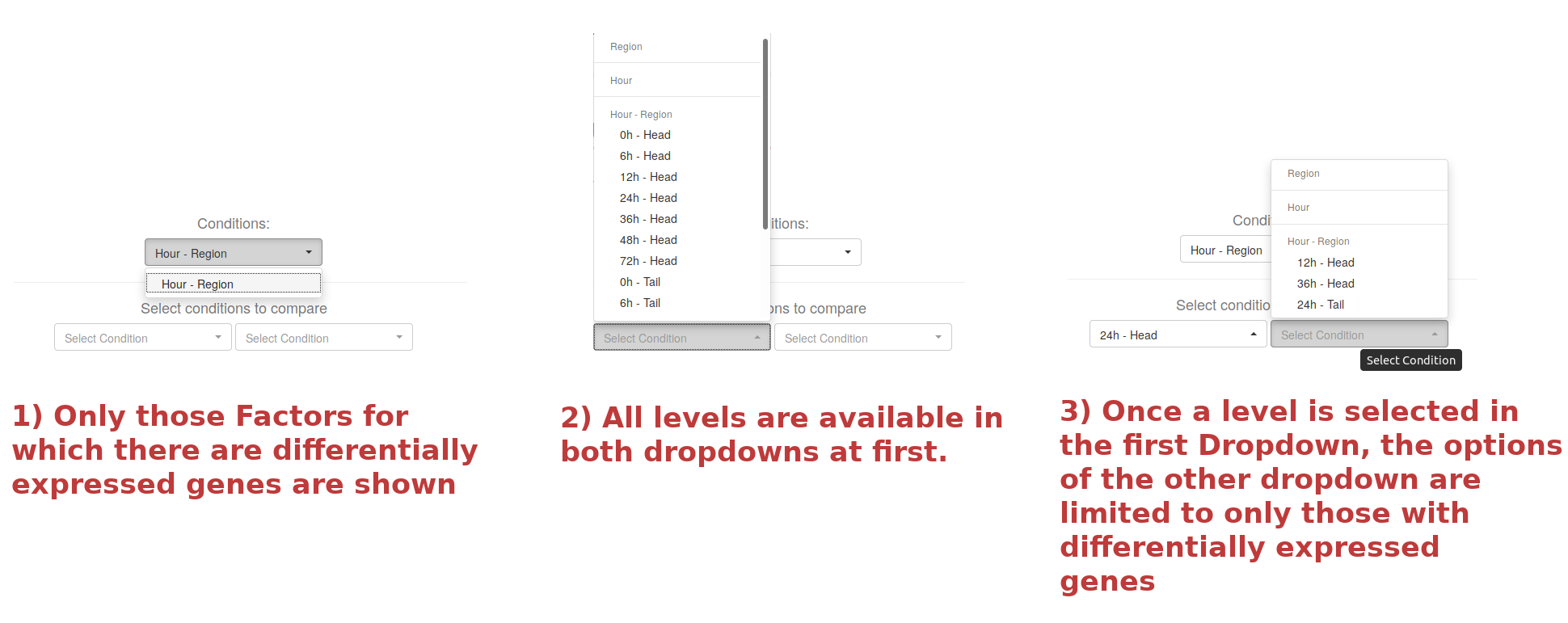
When choosing one level on one of the two "Select conditions to compare" dropdowns, only the levels for which there are pair-wise comparisons available will be visible on the second dropdown menu. When both condition levels have been selected, a table and a volcano plot will appear below.
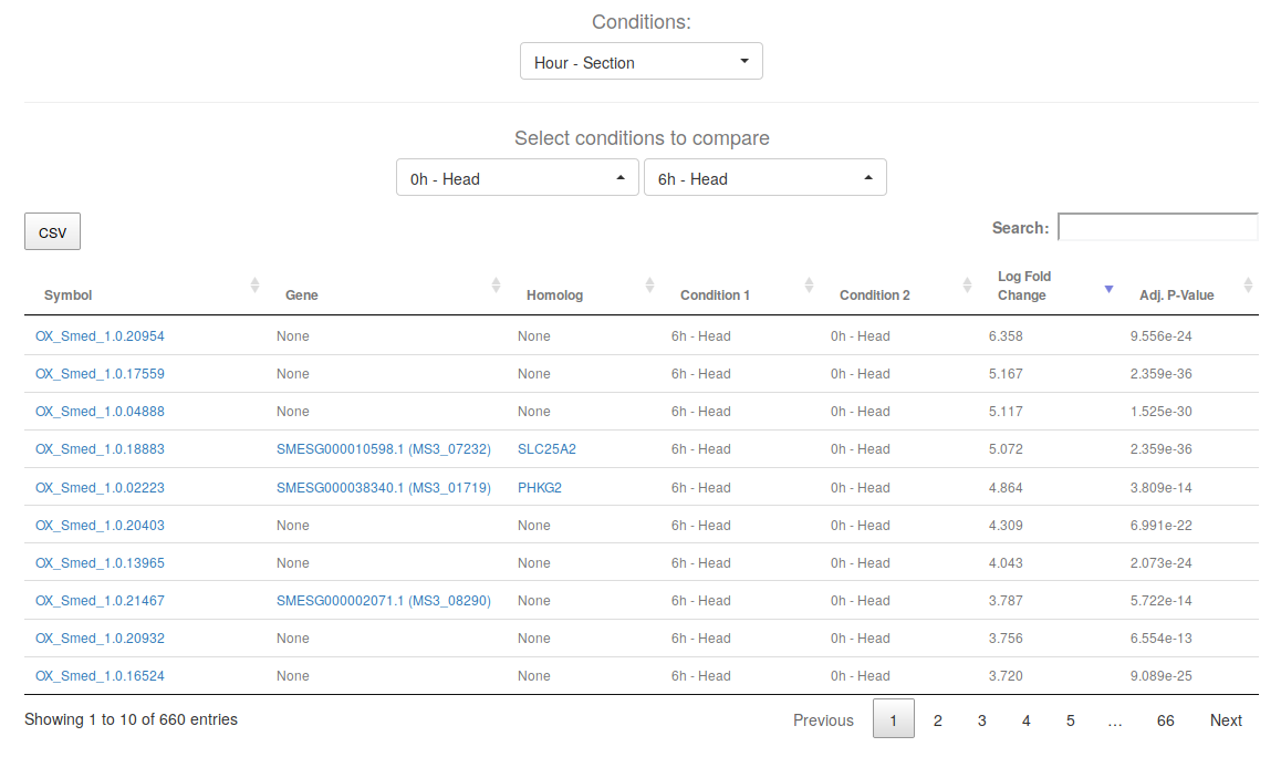
This table will contain the differentially expressed genes between the two selected levels (in this case, "0h Head" vs "6h Head"). The adjusted p-value cut-offs will be the ones described in the respective research article of the experiment.
Keep in mind that the order of "Condition 1" and "Condition 2" will determine the meaning of the Log Fold Change direction. The Log Fold Change will be computed as log ( Condition 1 / Condition 2), thus, positive fold changes will indicate over-expression in Condition 1 with respect to Condition 2, and negative fold changes under-expression.
Click on the names of transcripts, planarian genes or Human proteins to get a gene card with thorough information about its annotations, see information card. Download the table by clicking on the CSV button.

This volcano plot shows each differentially expressed gene in relation to its Fold change (x-axis) and its P-Value (y-axis). The higher the y-axis, the more significant the gene is in the comparison. Hover on the points of the plot to see the specific gene/transcript name and its values. The plot controls are located on the top right of the visualization, see plot controls.
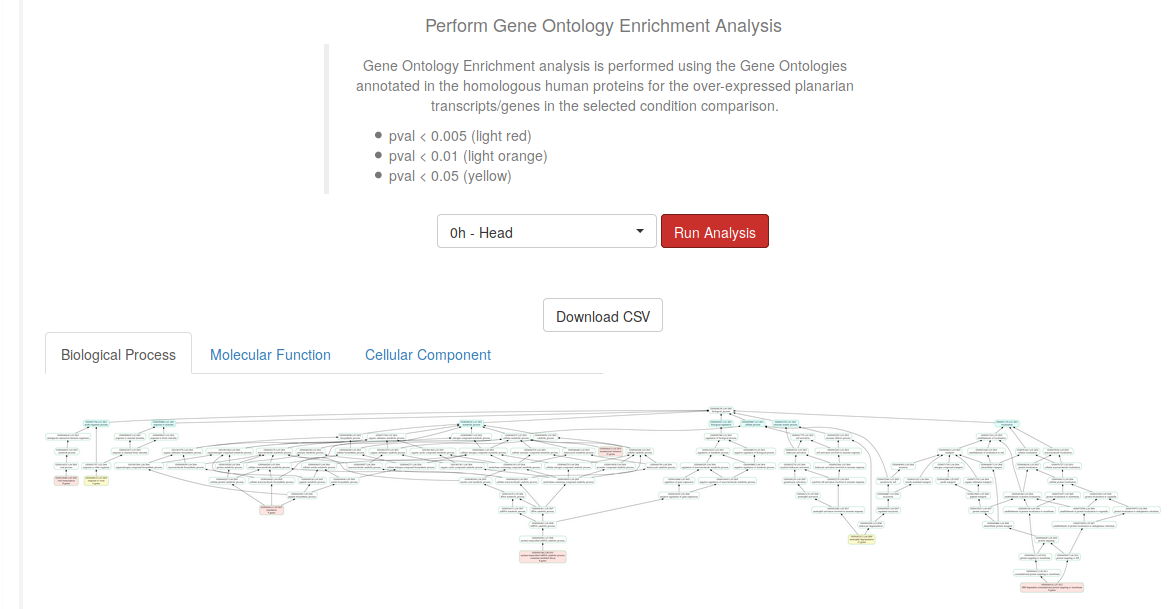
Select a particular level from the previously selected comparison and click on the Run Analysis button to perform a Gene Ontology Enrichment Analysis. Download the results using the Download CSV button, or download the images in each of the three available tabs (Biological Process, Molecular Function, and Cellular Component). The nodes in the networks, which represent the Gene Ontology Terms, are colored depending on their significance in the performed Fisher test.
Gene Expression Plot

The Gene Expression Plot section will allow us to plot the gene expression of one, or several, genes across the different conditions of the selected experiment. For this tutorial, we will use the experiment "2018 Rajewsky Cell Atlas". Check how to interact with these plots in the Plot Controls section.
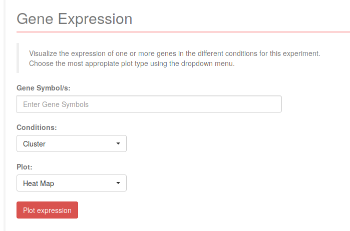
Write the genes you want to plot in the text input field. You can use planarian contig identifiers for the selected Dataset, planarian genes (SMESG...), human gene symbols from the HGNC database, PFAM domains (PF...), or Gene Ontology codes (GO:...).
Select the Condition you want to visualize the expression values for, and each level of that condition will be positioned in the x-axis of the visualizations.
1. Heatmap
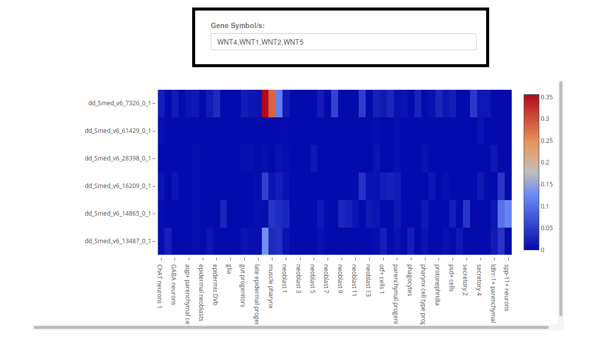
The Heatmap visualization will display the mean expression of each gene (row) in each condition (column) as a color gradient (right legend). Hover over the heatmap cells to see the expression values, and click on the transcript names to get a gene card and check their annotations.
Keep in mind that, if plotting many genes or conditions at the same time, not all row or column names will be displayed, and you will have to use the Zoom-in function to explore the graph efectively, see plot controls.
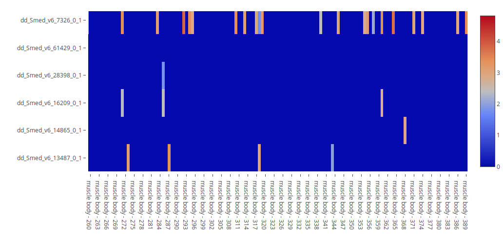
In the case of Single-Cell experiments, the Condition option "Samples" will appear in the Condition dropdown menu. When selecting it and plotting it, a heatmap where each column corresponds to a single cell will be shown. This visualization is useful for identifying genes that are co-expressed in specific cells, and for comparing their expression levels. Contrary to the section Gene Co-expression, this heatmap visualization allows for users to check more than two genes at the same time.
2. Violin/Bar plot

The violin plot visualization allows users to see the distribution of expression values (y-axis) in each given condition (x-axis). It is equivalent to a flipped density plot. Because Single-Cell experiments tend to have many cells with zero expression for many genes, when exploring a single-cell experiment the option "Show only expressing cells" will appear. This option will remove cells that don't express the given genes, allowing the comparison of expression values in only those cells that are already expressing the genes.
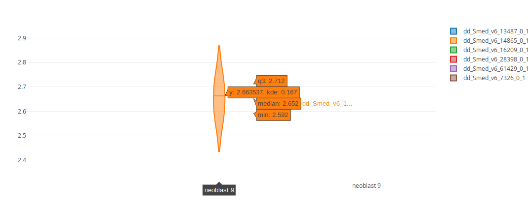
When hovering on the violins, several statistics will be displayed: the 3rd quartile, the median and the minimum value.
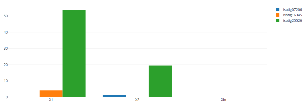
In the case of experiments with only one sample per condition level (that is, without replicates) instead of a violin plot a bar plot will be displayed. The above bar plot was created by performing the same search in the "2015 Abril DGE" experiment on the Dataset "Adamidi".
3. Line Chart
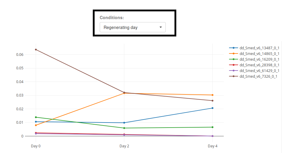
When visualizing conditions that can be ordered (as is the case of the condition "Regenerating Day" of "2018 Rajewsky Cell Atlas"), it is useful to use the plot type "Line Chart".

When selecting an interaction Condition that includes an ordered condition (like time), and plotting a Line Chart, several line charts will be created for each level of the interaction. In the image above, where the condition "Day - Cluster" was selected, a line chart for each Cluster will be shown.
Gene Co-expression

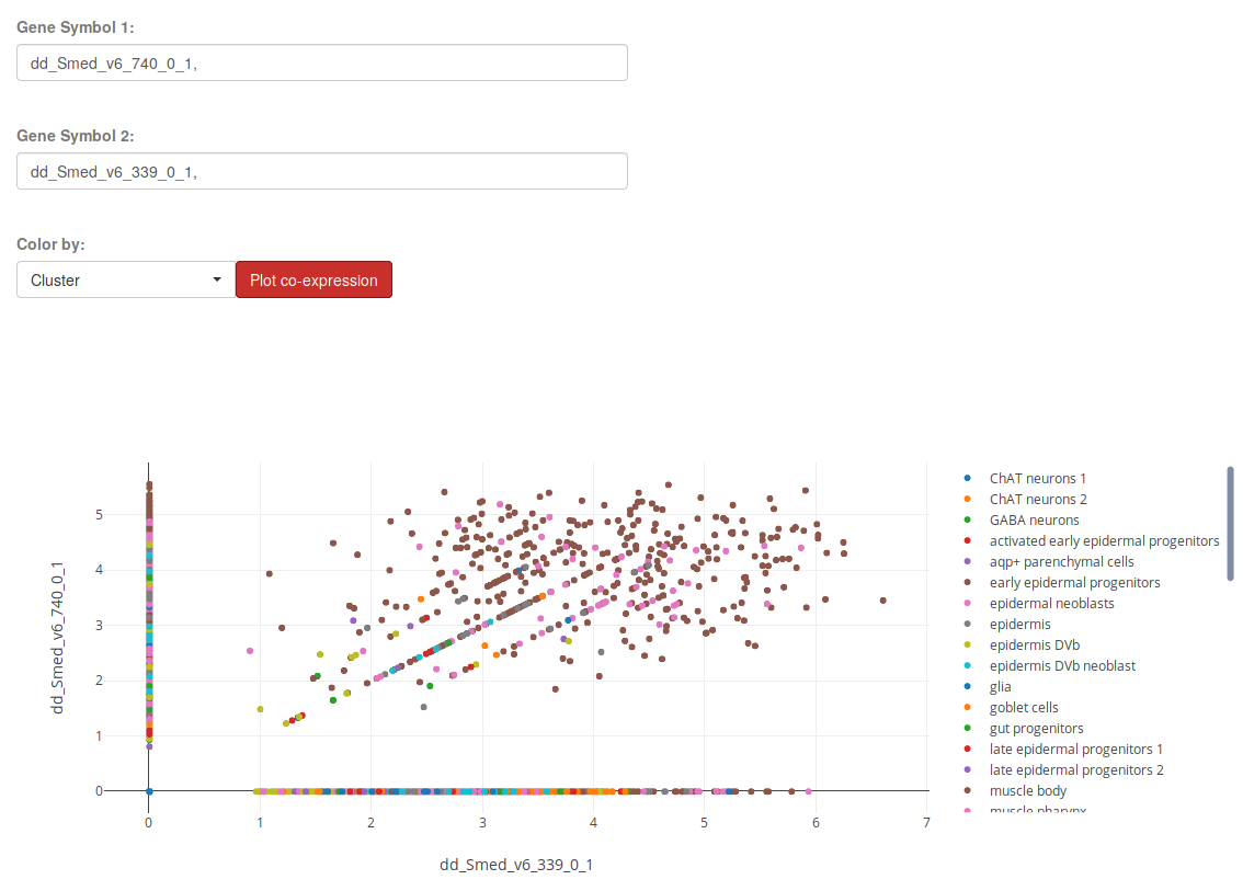
The section Gene Co-expression will allow you to plot the expression of two genes in each sample of a Single-Cell Experiment and color it by a particular condition. Use the plot trace legend on the right to hide or show the desired conditions, see plot controls.
t-SNE plot


For single cell experiments, PlanExp allows users to create t-SNE plots. In them, cells are represented as points in a 2D space, where similar cells with a similar expression profile will tend to appear together. Keep in mind that the dimensionality reduction performed by t-SNE does not conserve the distance in the initial N-dimensional space. For further information, see this page.
There are several options for plotting t-SNE visualizations for single cell experiments in PlanExp:

- Coloring each cell by condition.
- Coloring each cell by gene expression:
- Coloring cells by the expression of one gene.
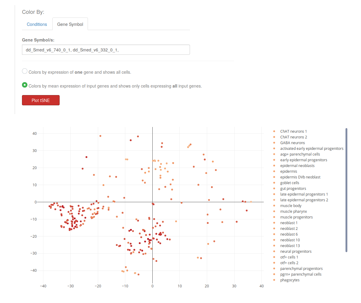
- Coloring cells by the mean expression of moltiple genes, and showing only those cells that express all of them.
When plotting gene expression in the "Gene" tab, there will be two new options in a radio button (see image above). Users will be able to color cells (points) depending on their expression of one gene, or multiple genes. When selecting the second option "Colors by mean expression...", only those cells that express all the input genes will be shown. For instance, in the example below, only those cells expressing both ("dd_Smed_v6_740_0_1" and "dd_Smed_v6_332_0_1") will appear in the plot, and they are colored by the mean expression:
(expression dd_Smed_v6_740_0_1 + expression dd_Smed_v6_332_0_1) / 2
Marker genes


Single cell experiments have a section, "Marker genes" in which genes that identify clusters of cells are listed as searchable tables. These were computed by Seurat's AUC classifier. Select a cluster for which to retrieve markers, and then a table will appear. The AUC column is the Area Under the Curve in a receiver operating characteristic curve of the classifier built using the gene as a classifier of cells. A gene that, when expressed, identifies a cell as a member of a particular cluster with 100% accuracy has an AUC of 1. The Average difference column indicates if the classifier is built on the expression (e.g.: if a gene is more expressed than a particular value, classify this cell as a member of the cluster), or on its lack of expression (e.g.: if a genes is less expressed than a particular value, classify the cell as a member of the cluster).
Each table can be downloaded by clicking on the CSV button.
Gene Regulatory Interactions


We performed a prediction of gene regulatory interactions for single cell experiments. Regulatory interactions define relationships of activation or inhibition between one gene (regulator) which activates or inhibits the expression of another gene (target). These predictions were performed with the program GENIE3.
GENIE3 requires users to define which genes are transcription factors (and thus, putative regulators of other genes). The selection of planarian genes as regulators was performed by looking at their PFAM annotations or at their GO annotations. The Source column of the generated table indicates if the regulator was decided to be a transcription factor by its PFAM domains or by its GO terms.
The score is a measure of how confident GENIE3 is of the prediction. However, this score does not have any statistical meaning.
Because the large number of regulatory links predicted by GENIE3, we binned them in 10 categories, sorted by score. Users can select which group of regulatory interactions they want to visualize on the table by using the dropdown menu on the top left.
The button CSV allows users to download the generated table, while the Send to Network viewer sends the whole table of regulatory links to the network viewer (see next section).
Network

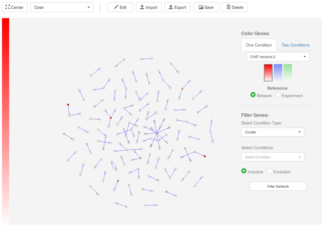
PlanExp network viewer allows users to map expression data onto regulatory networks. These can be either downloaded from PlanNET, retrieved from the Regulatory Interactions section, or created from scratch by users by using PlanExp Network Editor.
1. Network controls

The buttons above the Network viewer allow users to control the graph visualization in several ways.
- Center: Centers the visualization on the genes in the network.
- Layout Dropdown: Select a different graph layout.
- Edit: Opens the Network Editor.
- Import: Imports JSON file with network (downloaded from PlanNET NetExplorer, or from next button).
- Export: Exports graph to JSON for later use.
- Save: Saves a PNG image of the network.
- Delete: Deletes the whole network.
2. Network Editor
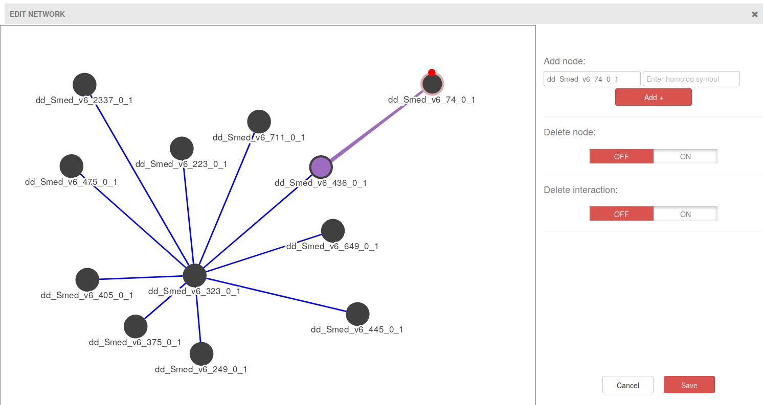
The Network Editor allows for the creation of nodes (genes) and edges (interactions), as well as their deletion. To add genes write a gene name on the top left input form and click on Add +. Manually created nodes have a pink border color so that they can be easily spotted.
To add interactions hover on one of the genes you want to create an interaction for, and a small red dot will appear (see image above). Click on the red dot and drag to the other gene of the interaction. When you release the mouse button, an interaction will appear (violet edge in the image above).
For deleting genes or interactions, click on the corresponding ON switch button and then click on the gene or interaction that you want to remove.
Once you are happy with the network, click on Save and the network will be sent to the main Network viewer.
3. Color genes on network
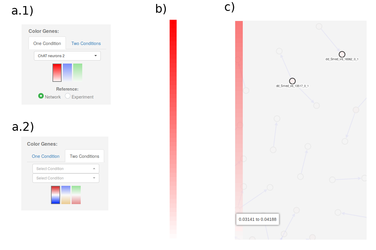
On the right of the Network Viewer main section, we have the controls to color genes according to their expression. Genes can be colored depending on their expression in One Condition or Two Conditions: (see a.1 and a.2).
In the One Condition tab, select the condition in the dropdown menu, the color profile, and the reference. The Network reference option will color the most expressed gene in the network as the strongest color in the color profile, and all the others according to their relation to that gene. The Experiment reference will color genes according to the gene with maximum expression in the experiment, even if that gene is not in the network. Genes will be colored in a gradient that goes from white (if they are not expressed) to strong red, blue or green (if they are highly expressed).
In the Two Conditions tab, users will have to select two Conditions to compare them. The color gradients will be divergent instead of linear. Genes will be colored by their log Fold change using the selected gradient.
Independently of the option used, once the genes have been colored a color legend will appear on the left (b and c in image above). Hovering on the legend will highlight the genes that are expressed in a particular range (c in image above).
4. Filter genes
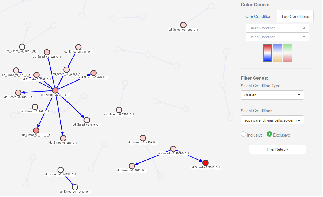
Genes in the network can be filtered out (make them hidden) by selecting one or several conditions on the Select Conditions dropdown menu (bottom right). Once the desired conditions have been selected, one can choose to filter the network by clicking on the Filter Network button.
The option Inclusive will show all genes that are expressed in at least one of the selected conditions. The option Exclusive will show only those genes expressed in all the selected conditions.
